Color Picker for Android
The Lightbox app allows users to alter the colour displayed on the lightbox screen. Previous colour-pickers used in Lightbox were sufficient for general use but lacked the fine control needed for some applications. The new colour picker provides three large controls for tweaking the hue, saturation and value aspects of a given colour. This means that for colours close to white it is now possible to finely tune the hue and saturation independently. There are also a few standard colours in the mini-palette to quickly jump to full white, red, yellow, green, blue or magenta. The original colour and the new colour swatches are also displayed allowing the user to reset to the original colour as a starting point. On larger displays, the controls will expand to make full use of the screen space (in portrait or landscape) for even finer control for the user.
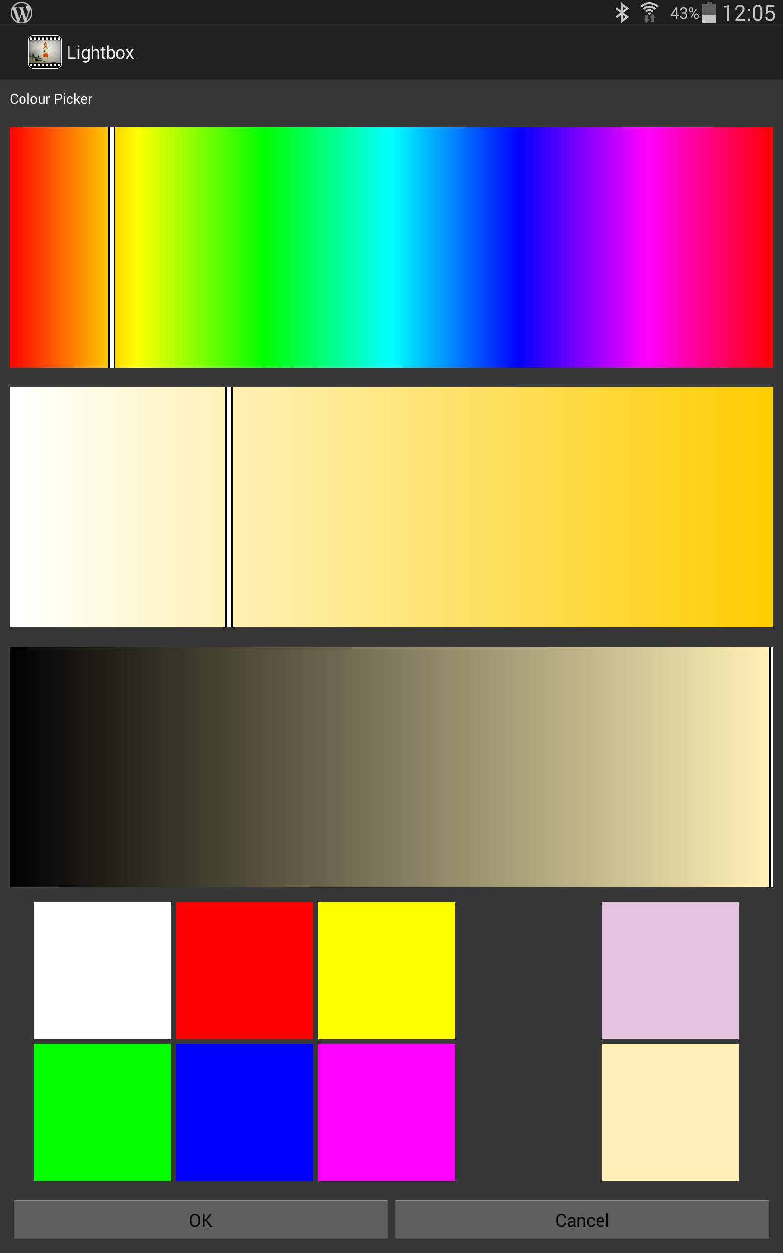
The mini-palette uses the AspectGrid from StackOverflow to provide a nice grid layout. The Hue, Saturation and Value sliders are derived from the SurfaceView with the canvas painted using the LinearGradient for background and a simple stroke line for the slider marker.
This provides a simple, but effective solution. There are also many alternatives if you are looking for solutions, with some particularly flexible and stylish implementations such as HoloColorPicker.